Hey Sankalp,
This is pending for a long time. You asked me to take a look at your portfolio and give feedback. While I did take a look, feedback part was postponed due to my laziness and studies.
Now that I have some time, I thought of a review.
Before starting: everything in this article is my personal opinion, “how I see it” stuff, no offence to you or your work.
The best thing about site is colour schemes. You have picked really great colours and they get along really well. About Me page looks drop dead gorgeous. Great work here!
About me page is great. So is Contact page.
Logo is good. I like it. The navigation on top right is again great as well. Though I do not like two of the icons. First one is “About Me” icon. It looks like this:

My thoughts on looking at this were: “No one looks at you under a magnifying glass when they want to know more about you.” So, just same image without the glass will better.
Contact Me icon is something that, depending on my mood, I interpret as following:
- A very sad baby
- A baby straight out of a scary movie.
A face with no expressions and two big eyes does not fit here at all! Perhaps an icon with just phone or email icon will work better.
Now, to the products, they are really innovative.
Zig Zag is nice and looks good. 270 degree is again something new. singnShock looks like a great alarm clock. Though the renders have strange reflections in glass which do not look that good.
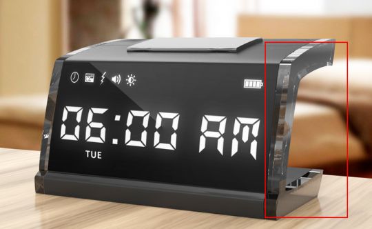
While the clock concept is great, these reflections kill the beauty in my opinion.
One last thing, the Creative Commons logo in footer is a bit of eye sore. Whole page is great but this logo doesn’t belong here. Why not put it under a copyright notice?
You are on the way to become a great product designer. So keep up the great work and good luck!